• Hi Guest!

    The costs of running this forum are covered by Sea Lion Press. If you'd like to help support the company and the forum, visit patreon.com/sealionpress

Cartographicum Thandeum

So, this isn't FTPT, the margin of victory isn't important in establishing safe seats. Surely a better approach is to show the percentage victory for the lead candidate.

So:
Local authority X
Brexit Party 40%
Liberals 30%
Labour 25% etc.

and Local authority Y
Brexit Party 30%
Liberals 20%
Labour 19% etc.

These will be the same colour on the map, but Brexit is clearly far weaker and so it is misleading. In General elections it is valuable to show how close the margin of victory is. Here, I just don't think it is.

The only other way to show it is separate maps per party. Leading party proportion of the vote just ends up looking like a majority shaded map so is more misleading in a different manner.
 
So, this isn't FTPT, the margin of victory isn't important in establishing safe seats. .
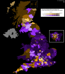
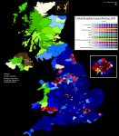
Quite the opposite. The margin is both more intuitive for those used to FPTP (not 'FTPT') maps and the margin between the leading party and the next highest is extremely important in determining the outcome of a party-list PR election. Let's take Scotland as the obvious example. The SNP got 37.8% of the popular vote, but half (3) of the MEPs. They did this because the other competing parties were way behind them and uselessly split the vote too many ways (the nearest being the Brexit Party on just under 15%). If the SNP had got 37.8% but the next highest party had got, say, 30%, then the SNP wouldn't have got half of the MEPs, which is intuitively indicated by a paler majority margin--but a popular vote map would show the same 37.8% either way.

Or say there's 3 seats on offer, one party has 35%, the next has 34%, and the others are useless divided scattering (11%, 10%, 10%). If you do a popular vote map then party A looks the same as party B because they'd both be in the 30% range. But party A gets twice as many seats as party B, because the D'Hondt formula gives one seat to A, then one seat to B, then the next biggest is less than A's vote divided by 2 so A gets the third seat. The margin is what mattered, not the popular vote range. Of course, it's still not perfect because it only shows the gap between first and second when you really need a way to show how fragmented the rest of the parties are, but it's at least a somewhat useful indicator.

(This is semantics either way because it only matters what the margin is across the entire region not the individual districts of course, but then what's the point of a breakdown map).

Of course, as Alex says the only really comprehensive way to do it is separate popular vote maps for each party, but that comes with its own can of worms like whether you use the same colour for everyone or not.

I actually got into making election maps because the Dave Leip US site only showed popular vote based maps for most elections, and those are so misleading I decided to start making majority-margin ones from scratch for everything.
 
Last edited:
With the election looming, it's time for me to do another Pointless Map Project in order to refamiliarise myself with the constituency names.

This time I did something I've been curious about for a while. A map of the 2015 general election, but if one only counts the votes cast for UKIP (12.6%) and the Lib Dems (7.9%) as though it was a two-party system. Doing maps where it's artificially restricted to two parties (see: America) is usually easier, and I was able to do this in just a couple of hours.

1575732199049.png

Unsurprisingly, UKIP win more seats than the Lib Dems (490 to 142 if my spreadsheet is correct). I could have chosen a better colour scheme here because there was considerable range in the majorities above 50%, but oh well. I was curious to see if any of these results foreshadowed the referendum results the year later. The answer is yes to a certain extent, but this is skewed by 1) areas where neither party had much support, e.g. Scotland, and 2) the Lib Dems fighting defensive campaigns to hold onto 2010-won seats, not all of which voted Remain in 2016.

(That is a very very pale shade of yellow on the City of Durham, not 'I forgot to colour it in' white).
 
A colour scale key for a possible upcoming project. Note that the final 'Fusion' colour would never appear in the same region as the separate Conservative and Constitution colours, so doesn't need to be distinct from either of them (but they do need to be distinct from each other).

View attachment 21858
Decided I needed a 7th colour, will have to see how well the pale shades stand out from each other.

1593788124197.png
 
Still absolutely cannot wait to see whatever this is in the wild.
So am I - bear in mind it will take a while, though I've been working on the spreadsheets for an hour before bed every night for weeks.

I did think that needing 7 colours probably didn't indicate a dominant party system where vote shares above 60% were regularly achieved.
I haven't decided yet whether to do voteshares or majorities, either seems reasonable (but the former may use the darker shades).
 
Back
Top