• Hi Guest!

    The costs of running this forum are covered by Sea Lion Press. If you'd like to help support the company and the forum, visit patreon.com/sealionpress

Cartographicum Thandeum

Finally finished the electorate-share maps for 2019 for the Conservatives and Labour.

1634858290406.png
1634858299420.png

A lot to unpack here, but one thing that immediately jumps out is how dark red spots in England for Labour correlate to Lib Dem vote-squeezing campaigns in individual seats. It's also interesting how there's an east/west divide compared to 2017 in the fading Labour vote in South & West Yorkshire.
 
Not my own work, but an interesting find: a US congressional map from 1880 (showing the 1878 results I believe) which has red Republicans, buff Democrats and green 'National' (Greenback) congressmen: https://www.davidrumsey.com/luna/servlet/detail/RUMSEY~8~1~327941~90096507:political-Map-of-the-United-States-?sort=pub_list_no_initialsort,pub_date,pub_list_no,series_no
A couple of years back I was doing something that involves looking through history textbooks from different sources, and there are at least a couple of textbooks in recent use (read: assigned 2016-17, most likely published no earlier than about 2008) that have blue-green and red-yellow color schemes for Democrats and Republicans, respectively.
 
After a bit of a break, here's the 2019 electorate-share results for the Liberal Democrats:

1635894990987.png

Quite a significant recovery from 2017 in terms of votes (if not seats), but obviously an uneven one. There's a whole discussion to be had here about Labour were running scared of the Lib Dems outflanking them in Remain seats, when the Lib Dems' chances in Labour-held seats were much worse than those in Remain-voting Conservative ones. I hadn't realised just how many near misses the Lib Dems actually had, with a number of such Tory MPs narrowly holding their seats. While the target seats still often stick out, there's much more of a gradient of background support here and less 'blue island in a dark red sea' compared to 2017, with limited but noticeable recovery in the 'generic background support in no-hoper seats' we were accustomed to back in 2005.

Also note the large number of grey seats due to electoral pacts with Plaid and the Greens.

I'll also be doing another SNP map. Probably won't bother with the Brexit Party and the Greens as it wouldn't be a very interesting map. Might go back and do 2010 though as it's all the same boundaries (back to 2005 for Scotland!)
 
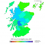
Here's the SNP 2019 electorate-share map:

1636591735113.png

Quite a contrast to both 2015 and 2017. You can really see the areas they threw the kitchen sink at (mostly vs the Tories) while at the same time you've got Kirkcaldy & Cowdenbeath, which they still won despite its sickly chartreuse shade (three-way race, lowish turnout, disowned candidate who narrowly beat Labour anyway).
 
Probably the penultimate map I'll do in this series: Lib Dem electorate-share map in the 2010 general election:

1638313627346.png

In contrast to the more recent performances, the only deep-red sub-5% areas are in Scotland here. There's more of a gradation to a background level of support and less of the 'targeted hotspot surrounded by nowt' seen more recently, though it is still there in places (again, Scotland in 2010 is most similar to the Lib Dems' profile across Great Britain in 2019). Some places, notably southwest London, have deeper Lib Dem support now than they did in 2010, interestingly. Also, Tim Farron's ability to break the colour scale scares me.
 
Also on the subject of political party symbols, I wanted to come up with one for the Unionist Party/Parti unioniste of the Anglo-French Union I recently did a list about. Thought I'd come up with a whizzo idea inspired by the Tories using the oak tree (which is a recent thing under Cameron but reflects a much older use of the Royal Oak symbolism so it's fine). Have an English oak with its branches entwined with whatever the national tree of France is...

(looks it up) Oh. It's the oak.

Well, that's awkward.
On the plus side, at least I came up with something for the opposition:

1639092321137.png
 
Also on the subject of political party symbols, I wanted to come up with one for the Unionist Party/Parti unioniste of the Anglo-French Union I recently did a list about. Thought I'd come up with a whizzo idea inspired by the Tories using the oak tree (which is a recent thing under Cameron but reflects a much older use of the Royal Oak symbolism so it's fine). Have an English oak with its branches entwined with whatever the national tree of France is...

(looks it up) Oh. It's the oak.

Well, that's awkward.

Ooh, pair of oak leaves forming a sort of laurel wreath formation?
 
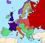
I had an idea last night for a US/USSR swapped end of Cold War setup, where the modern US successor state resembles OTL Russia (or how Russia sees itself). Unfortunately, it really needs a wikibox and I don't know how to make them properly, but here's a rough sketch:

1645103525684.png

Now there is a problem that the geography doesn't really work: Canada is the obvious analogue for NATO/the EU expanding into territories that became independent after the fall of the Union, but a lot of the US territories that best fit the 'stans of Central Asia border Canada rather than Mexico (which is China in this analogue). Minnesota is also put in an awkward position, as culturally it seems to fit with states that might want to join Canada, yet its location next to the 'stan states doesn't fit. I may need to rethink that. The other problem was what to make Ukraine: I was going to do California, with San Diego being the Crimea, but then I changed it to Michigan as the UP seems a better 'rhyme' for Crimea. I can't decide which is better - San Diego fits the naval base thing, but on the other hand would making California Ukraine be like implying Russia has lost Vladivostok - ugh.

Also I made Georgia Georgia because come on, who wouldn't, and Florida is supposed to be Armenia and Azerbaijan. Texas is Belarus, New Mexico and Arizona are supposed to be examples of 'stans which now look more towards China than Russia.

(Red = American Federation, light red = independent states aligned with the AF, mid-red = areas occupied by the AF or unrecognised republics backed by the AF, green = Mexico, light green = independent states increasingly more aligned with Mexico, dark blue = North American Union né Canada, light blue = independent states wishing to join the NAU, grey = other states).

edit: I'm now realising I should have put in something to represent Moldova and Transnistria, hmm.
 
I had an idea last night for a US/USSR swapped end of Cold War setup, where the modern US successor state resembles OTL Russia (or how Russia sees itself). Unfortunately, it really needs a wikibox and I don't know how to make them properly, but here's a rough sketch:

View attachment 50023

Now there is a problem that the geography doesn't really work: Canada is the obvious analogue for NATO/the EU expanding into territories that became independent after the fall of the Union, but a lot of the US territories that best fit the 'stans of Central Asia border Canada rather than Mexico (which is China in this analogue). Minnesota is also put in an awkward position, as culturally it seems to fit with states that might want to join Canada, yet its location next to the 'stan states doesn't fit. I may need to rethink that. The other problem was what to make Ukraine: I was going to do California, with San Diego being the Crimea, but then I changed it to Michigan as the UP seems a better 'rhyme' for Crimea. I can't decide which is better - San Diego fits the naval base thing, but on the other hand would making California Ukraine be like implying Russia has lost Vladivostok - ugh.

Also I made Georgia Georgia because come on, who wouldn't, and Florida is supposed to be Armenia and Azerbaijan. Texas is Belarus, New Mexico and Arizona are supposed to be examples of 'stans which now look more towards China than Russia.

(Red = American Federation, light red = independent states aligned with the AF, mid-red = areas occupied by the AF or unrecognised republics backed by the AF, green = Mexico, light green = independent states increasingly more aligned with Mexico, dark blue = North American Union né Canada, light blue = independent states wishing to join the NAU, grey = other states).

edit: I'm now realising I should have put in something to represent Moldova and Transnistria, hmm.

I made a similar worldmap a while back; not sure how well it holds up, mind. I recall that Deseret was meant to have its own Chechnyan War, but to have ended up as a frozen conflict zone with de facto independence.

February Coup.png
 
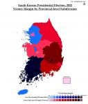
So I tried to map the recent South Korean presidential election. See, you might say majority-margin maps don't make sense for breakdowns of nationwide elections (as opposed to local district based FPTP races), but I like them because they give you a better idea of levels of support (so long as it's between two major parties that take up most of the vote). In a popular vote based map, if you have a 50.1 blue - 49.9 red province next to one that's the reverse, the typical 50% popular vote blue shade and 50% popular vote red shade make it look like those provinces are politically totally different, rather than being very similar. Whereas a majority margin map shows how close it is.

Anyway, this is not unrelated to why I chose to map this one - the popular vote based map on Wikipedia makes it look incredibly geographically polarised. On trying this, I found that, er, it is incredibly geographically polarised - at least in the southern provinces, but at least now I know for sure.

This was problematic because finding a good basemap of South Korean provinces is very hard - and I only found out after I started that they've either changed the boundaries with Sejong and Daejeon, or they define them differently for vote counting. Hence some mid-map basemap surgery, which I never enjoy. Also, the crinkly bits along the coast (and all the little islands - Slartibarfast would approve) are very annoying and make Scotland look like Wyoming by comparison. But I did my best.

I wanted to do it by a lower-level municipal division, but I couldn't find the data, which is just as well as I went quite mad enough translating the provincial data as I only found it in Korean. Well at least I know now what north and south are in Korean (which I could guess as they're slightly similar to the Chinese terms).

Not up to the standards of my usual work, then, but here it is:

1647088988430.png
 
Back
Top