
That looks realistic, it's a good combination of 'striking' and 'too complicated due to being designed by committee'. (I know the Five Races stripes are a tradition but I mean the stars as well).I'm actually quite proud of this flag I've been working on for the last little while, a new iteration on an older concept I've had for the United Republic of China, both the precursor to and the province of the United Earth in Star Trek.
View attachment 24417
It's modeled on a hybrid of the symbolism of the Five Races Under One Union flag of the Chinese Revolution of 1912, with the symbols of both the Great Qing preceding it and the People's Republic of China succeeding it.
The five colors represent the traditional Five Peoples of China - the Han, the Manchus, the Mongols, the Tibetans and the Hui. The five stars both have that original meaning, but intermixed with one another to show the interlaced nature of the Chinese people, as well as representing the Five Elements: Fire, Earth, Wood, Metal and Water.
The dragon is an ancient symbol of China, of course, and this usage is inspired by the Qing dynasty's flag, as well as other historical use of the dragon to represent China and Chinese culture, nationality and sovereignty. The dragon also has four of the five colors representing the Five Peoples, being already surrounded by the fifth color, representing how all of the peoples together make a single China.
In-universe, this flag was modeled on the use of various Five Races Under One Union flags that became common as a unity symbol during the mid-21st century Chinese Democracy Movement that finally ended the one-party rule of the Communist Party in mainland China, and created China's modern democratic government, which adopted the name the United Republic of China to commemorate the reunification of the People's Republic of China and the Republic of China together with the former British and Portuguese territories of Hong Kong and Macao, under a single Chinese government system for the first time since the Qing Dynasty.

-
Hi Guest!
The costs of running this forum are covered by Sea Lion Press. If you'd like to help support the company and the forum, visit patreon.com/sealionpress
You are using an out of date browser. It may not display this or other websites correctly.
You should upgrade or use an alternative browser.
You should upgrade or use an alternative browser.
The SLP Flag Thread
- Thread starter Miner
- Start date
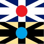
1) The flag of the Imperial Alliance between the British and Japanese Empires, flown at joint summits, on boats (outside of the home fleets), and in jointly administered colonies in Asia. Due to its association with colonialism and conquest, it spawned:
2) The flag of left-wing dissidents in Britain and Japan, and their second-generation diaspora in some of the colonies - a symbolic inversion of the imperial symbol. (Communists replace the yellow with the people's red)
2) The flag of left-wing dissidents in Britain and Japan, and their second-generation diaspora in some of the colonies - a symbolic inversion of the imperial symbol. (Communists replace the yellow with the people's red)
Attachments
- Location
- Grittysborough
- Pronouns
- he/him
I am offering up the following for commentary and critique, because I know broadly what I'm trying to do but I can't manage to achieve it.

This is for Fashions Made Sacred, and this is what must be the two-thousandth interpretation of the flag of the Republic of Spain.
The two diamonds on either side are intended as a figurative representation to call the Pillars of Hercules to mind without directly having them on the flag, with their being black instead of white to represent the black flags used to represent anti-monarchism in Spain in the 19th century ITTL. The blue below is the Sea, while the blue above is the Heavens, invoking the division of the waters in Genesis, while the sun sets over the water to the west beyond the Sea.
Non plus ultra is the motto of the Spanish Republic, which is said to have been written on the Pillars of Hercules in Antiquity as a warning to those leaving the Mediterranean -- that there was nothing further beyond (in Latin, Nothing further beyond). This story was reversed before the PoD by Charles I (and V) into his motto Plus ultra (in Latin, Further beyond), in reference to Spain's empire in the Americas.
ITTL, the reversal is considered crucial by the Spanish republicans as a rejection of the Habsburgs (who ITTL reigned into the 20th century) and what they ideologically see as the Habsburg empire beyond the sea, rather than Spain's -- it proclaims a theoretically anti-imperialist message that Spain, having rid itself of the Habsburgs, has also rid itself of the Habsburg ambition of dominion beyond its borders (it is of course, in fact, blatantly hypocritical, and they continue even in the 21st century to own a fraction of the old Spanish colonial empire in Africa).
Despite not actually liking mottos on flags myself, I feel like TTL's Spain would put it there whether I like it or not, so any design would still have that writing somewhere.
The use of blue is also intended to invoke the Virgin, as the Spanish Republic remains very Catholic.
The problem is that I don't like how the elements have come together and I would appreciate suggestions of how to improve it while still trying to broadly get this whole message across in the symbolism.
Well, it would be more aesthetically pleasing if the sunset and motto were larger, but that comes down to one of those questions of whether AH flags should necessarily be aesthetically pleasing if they're meant to be plausibly designed by committee.I am offering up the following for commentary and critique, because I know broadly what I'm trying to do but I can't manage to achieve it.
View attachment 28323
This is for Fashions Made Sacred, and this is what must be the two-thousandth interpretation of the flag of the Republic of Spain.
The two diamonds on either side are intended as a figurative representation to call the Pillars of Hercules to mind without directly having them on the flag, with their being black instead of white to represent the black flags used to represent anti-monarchism in Spain in the 19th century ITTL. The blue below is the Sea, while the blue above is the Heavens, invoking the division of the waters in Genesis, while the sun sets over the water to the west beyond the Sea.
Non plus ultra is the motto of the Spanish Republic, which is said to have been written on the Pillars of Hercules in Antiquity as a warning to those leaving the Mediterranean -- that there was nothing further beyond (in Latin, Nothing further beyond). This story was reversed before the PoD by Charles I (and V) into his motto Plus ultra (in Latin, Further beyond), in reference to Spain's empire in the Americas.
ITTL, the reversal is considered crucial by the Spanish republicans as a rejection of the Habsburgs (who ITTL reigned into the 20th century) and what they ideologically see as the Habsburg empire beyond the sea, rather than Spain's -- it proclaims a theoretically anti-imperialist message that Spain, having rid itself of the Habsburgs, has also rid itself of the Habsburg ambition of dominion beyond its borders (it is of course, in fact, blatantly hypocritical, and they continue even in the 21st century to own a fraction of the old Spanish colonial empire in Africa).
Despite not actually liking mottos on flags myself, I feel like TTL's Spain would put it there whether I like it or not, so any design would still have that writing somewhere.
The use of blue is also intended to invoke the Virgin, as the Spanish Republic remains very Catholic.
The problem is that I don't like how the elements have come together and I would appreciate suggestions of how to improve it while still trying to broadly get this whole message across in the symbolism.
If I may volunteer a suggestion, perhaps the top of the setting sun could reach the center of the flag? That might make it more readily identifiable.the sun sets over the water to the west beyond the Sea.
- Location
- Derbyshire

Personally I think it looks fine like this.@Ciclavex, How's this? I've lightened the blue to match the OTL Argentine flag- that very saturated blue is something that makes it look very 'Web 1.0 interpretation'. Increased the size of the sun, and also centralised it because it was a bit off-centre and that never helps.
- Location
- Grittysborough
- Pronouns
- he/him
@Ciclavex, How's this? I've lightened the blue to match the OTL Argentine flag- that very saturated blue is something that makes it look very 'Web 1.0 interpretation'. Increased the size of the sun, and also centralised it because it was a bit off-centre and that never helps.
View attachment 28329
That's brilliant, thanks! That has a much better feel to it.
- Location
- Derbyshire
That's brilliant, thanks! That has a much better feel to it.
My top tip is to always get your colours from existing flags, and use the current Wiki images. There's some older websites that are quite noticeably more intense because of the limited colour palette available when they were created.
- Location
- Grittysborough
- Pronouns
- he/him
My top tip is to always get your colours from existing flags, and use the current Wiki images. There's some older websites that are quite noticeably more intense because of the limited colour palette available when they were created.
Yeah, I was trying to mix my colors myself and I was increasingly less happy with it the more that I fussed, which is one of several reasons why I finally just posted it here.
Not done one of these for a while, so here are the flags of Europe in Look to the West at the start of the Black Twenties period of upheaval.

(edit: just realised I somehow missed Spain off the end, so have added it)
(edit: just realised I somehow missed Spain off the end, so have added it)
Last edited:
Makemakean
Mr Makemean
- Pronouns
- Logical, unlike those in German
Not done one of these for a while, so here are the flags of Europe in Look to the West at the start of the Black Twenties period of upheaval.
View attachment 37423
"Hey Andorra! Åland called! They want their flag back!"
Note that the Norwegian flag is not the same as in OTL, owing to that one having been invented in the early 19th century, very good. A bit perturbed though that they went for the same design as the Scanian provinicial flag.
I very much like the Scottish and English flags, and the Jacobin heritage in the Portuguese flag (they're still officially Jacobin, aren't they?).
On the topic of the Scandinavian Jacks, We did have those during the United Kingdom of Sweden and Norway, and I always have found those very odd, seeing the design is more or less stolen from the way the British did their Jacks.
Dan1988
DO! YOU! HEAR THE SONG OF PEACE!
- Location
- North America
- Pronouns
- he/him
A bit perturbed though that they went for the same design as the Scanian provinicial flag.
Probably tried going for the Kalmar Union look, but forgot which colors go where. A lot like this design I created many moons ago (though not for Norway).

Yellow on red is from the coat of arms (some proposed Norwegian flags used it in OTL). This also technically means it's a reuse of an earlier flag that was used for the whole Nordic Empire when it still included Billungia, which may have played a part in its choice here.Note that the Norwegian flag is not the same as in OTL, owing to that one having been invented in the early 19th century, very good. A bit perturbed though that they went for the same design as the Scanian provinicial flag.
Makemakean
Mr Makemean
- Pronouns
- Logical, unlike those in German
Yellow on red is from the coat of arms (some proposed Norwegian flags used it in OTL). This also technically means it's a reuse of an earlier flag that was used for the whole Nordic Empire when it still included Billungia, which may have played a part in its choice here.
No, I know that. When I was doing my own flags for the Swedish Strangerverse, I noted that it was a suggested design, and, frankly, it makes sense. Those are, as you note, the traditional colours of Norway, obviously they would want to go for a Scandinavian cross design, and it would be the simplest most natural design. If anything, it's strange that they did not go with that one, but went with a design that stressed their centuries of being a virtual colony of Denmark's.
Still, as a Scanian, I just couldn't have them have that flag. It's just too strange to me.
To give you an idea, it feels as weird as it would to you as a Yorkshireman if you were to read a timeline in which the Irish flag is a white rose on a blue background. Obviously, I completely understand why others would go for the yellow cross on a red background for the Norwegian flag in their works, and I would not suggest changing it, but I personally just cannot make myself content with the idea for a timeline that I'm writing.
You don't need to make analogies, I feel that way every time I see Sweden using the three crowns on blue when I associate that with HullNo, I know that. When I was doing my own flags for the Swedish Strangerverse, I noted that it was a suggested design, and, frankly, it makes sense. Those are, as you note, the traditional colours of Norway, obviously they would want to go for a Scandinavian cross design, and it would be the simplest most natural design. If anything, it's strange that they did not go with that one, but went with a design that stressed their centuries of being a virtual colony of Denmark's.
Still, as a Scanian, I just couldn't have them have that flag. It's just too strange to me.
To give you an idea, it feels as weird as it would to you as a Yorkshireman if you were to read a timeline in which the Irish flag is a white rose on a blue background. Obviously, I completely understand why others would go for the yellow cross on a red background for the Norwegian flag in their works, and I would not suggest changing it, but I personally just cannot make myself content with the idea for a timeline that I'm writing.

Makemakean
Mr Makemean
- Pronouns
- Logical, unlike those in German
You don't need to make analogies, I feel that way every time I see Sweden using the three crowns on blue when I associate that with Hull
You could have gone for Oxford University, but of course, as a good Cambridgeman, you opted to go for the place with a Great University instead.
Some more LTTW flags:

- Location
- Coventry
I'm just going to assume the World Societist Combine is like the Khymer Rogue on steroids.
My own question about it is, does the symbol refer to something specific?I'm just going to assume the World Societist Combine is like the Khmer Rouge on steroids.