Also here's a spreadsheet I kept meaning to send to @Witch0Winter with the state legislature numbers going back to 1970.
-
Hi Guest!
The costs of running this forum are covered by Sea Lion Press. If you'd like to help support the company and the forum, visit patreon.com/sealionpress
You are using an out of date browser. It may not display this or other websites correctly.
You should upgrade or use an alternative browser.
You should upgrade or use an alternative browser.
Cartographicum Thandeum
- Thread starter Thande
- Start date
Also here's a spreadsheet I kept meaning to send to @Witch0Winter with the state legislature numbers going back to 1970.
First of all, cool thing.
Second of all, I noticed some (well one) mistake from a brief look. It lists Arkansas as having a GOP state senate in 2006 and 2008, 27 Republicans to 8 Democrats. The numbers were actually the other way around (as the Republicans didn't take back the senate until 2012).
Or maybe I'm misreading this thing since I booted it up in OpenOffice Calc. If so, sorry.
No, there probably are mistakes because of how I had to fill it in - basically trying to match the lists of numbers on wiki (which only add a new line of cells when the number changes) to election dates. It is a staggering observation that many US state legislatures have more changes in seat numbers from midterm defections (or immediately after the election!) than from the elections themselves, which frequently have no impact on the seat balance.First of all, cool thing.
Second of all, I noticed some (well one) mistake from a brief look. It lists Arkansas as having a GOP state senate in 2006 and 2008, 27 Republicans to 8 Democrats. The numbers were actually the other way around (as the Republicans didn't take back the senate until 2012).
Or maybe I'm misreading this thing since I booted it up in OpenOffice Calc. If so, sorry.
Sorry, what are you asking for - a blank county map?If it's not a problem, could I have one large sheet of US states and all of their counties? I might want to do some stuff after the election for county legislatures and executive offices and the like.
Sorry, what are you asking for - a blank county map?
Yes, but for each state. One for Arizona, California, Georgia, Texas, etc.
All of the states separate, not one big US map showing all of the counties.
I have them on another computer for each state separately, but not all together - that would be a big file.Yes, but for each state. One for Arizona, California, Georgia, Texas, etc.
All of the states separate, not one big US map showing all of the counties.
I have them on another computer for each state separately, but not all together - that would be a big file.
Even if you could send them one at a time, preferably from least amount of counties to most, that would be appreciated.
I mean, it's not like I'm getting Texas or Georgia done asap.
Remind me and I'll do it when I have access to them.Even if you could send them one at a time, preferably from least amount of counties to most, that would be appreciated.
I mean, it's not like I'm getting Texas or Georgia done asap.
@Ares96 and @Alex Richards reminded me I never posted a US Senate series I made, so here it is updated to 2020:

The annoying thing about the Senate is how to count special elections. When I first made a version of this, I only counted the elections that Wiki groups with a full election year - however, this is incredibly arbitrary, so this time I've tried to sort through and include all the special elections. The really annoying ones are the ones held in the same year as the regular election for that class of seat, or (as in the most ridiculous examples, like North Carolina in 1986) when they hold two separate elections on the same day for the last few weeks of someone's term and then the new term that's about to begin! Not only is it a stupid way to run a government, it's also really annoying to fit in the box...
Anyway, let me know if you spot any errors or missing special elections before I put it on the AJRElectionMaps Deviantart.
This is to do with a project I've had a vague idea for - before I can do that, I need a crude, editable map of European languages (roughly). Because every pillock on the internet saves them as uneditable file formats, I have to make my own - feel like I'm back in 2005 making the first UCS maps.
Tried doing a smaller version of this but strangely the file size turned out bigger, so might as well do it like this:
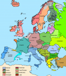
Yes I know there's a dozen arbitrary simplifications that could probably start a flamewar or an actual war, but it's adequate for my purposes. What do those other languages in the corner signify? Time will tell.
Tried doing a smaller version of this but strangely the file size turned out bigger, so might as well do it like this:

Yes I know there's a dozen arbitrary simplifications that could probably start a flamewar or an actual war, but it's adequate for my purposes. What do those other languages in the corner signify? Time will tell.
kratostatic
You Wouldn't Steal A Political Party
- Location
- Anyers-upon-Senn, Island-of-France
- Pronouns
- He/him
Yes I know there's a dozen arbitrary simplifications that could probably start a flamewar or an actual war, but it's adequate for my purposes. What do those other languages in the corner signify? Time will tell.
Serbo-Croation springs to mind for the wars.
Do the colours mean anything in particular or are they just arbitrary? I thought they were vaguely to do with language groups but then the Celtic languages are the same colour as the Germanics.
Rather than having to come up with my own colour scheme, I cleverly just nicked one from another map so it's their problem (yes it also makes Hungarian look more similar to Germanic than Slavic does, which is a choice).Serbo-Croation springs to mind for the wars.
Do the colours mean anything in particular or are they just arbitrary? I thought they were vaguely to do with language groups but then the Celtic languages are the same colour as the Germanics.
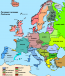
Here's another test map, trying out bold text instead, and showing endonyms rather than exonyms for languages:
Conservative % electorate-share, 2017 - rainbow heatmap
(I.e. what percentage of eligible voters, not actual voters, voted Conservative in each constituency)

Same, but for Labour:

NB these are done to 1 decimal place and then rounded down, never up (i.e. if it's 16.8%, that gets the 14% not 17% colour). At least, I think I did it that way from the start when I started working on these (checks notes) four years ago, he says nervously.
(I.e. what percentage of eligible voters, not actual voters, voted Conservative in each constituency)

Same, but for Labour:

NB these are done to 1 decimal place and then rounded down, never up (i.e. if it's 16.8%, that gets the 14% not 17% colour). At least, I think I did it that way from the start when I started working on these (checks notes) four years ago, he says nervously.
Lib Dem electorate-share map, 2017.

In this election, the level of 'background' support for the party had fallen to almost nothing outside the South of England and a few other areas, but this did not stop the characteristic highly effective campaigns in currently held seats elsewhere. This leads to a very artificially sharply-defined map, in contrast to the more gradual gradients seen in the Labour and Tory maps. I will repost my 2015 maps at some point, and the Lib Dem and UKIP maps are an interesting contrast, UKIP with far more votes but dispersed uselessly across the country rather than focused. It is also noteworthy that in some seats the Lib Dems held until 2015, local support was maintained while in others it collapsed very rapidly. Note that in addition to not standing a candidate in the Speaker's seat of Buckinghamshire, the Lib Dems also made a pact with the Greens that involved them not standing candidates in Skipton & Ripon and Brighton Pavilion.

In this election, the level of 'background' support for the party had fallen to almost nothing outside the South of England and a few other areas, but this did not stop the characteristic highly effective campaigns in currently held seats elsewhere. This leads to a very artificially sharply-defined map, in contrast to the more gradual gradients seen in the Labour and Tory maps. I will repost my 2015 maps at some point, and the Lib Dem and UKIP maps are an interesting contrast, UKIP with far more votes but dispersed uselessly across the country rather than focused. It is also noteworthy that in some seats the Lib Dems held until 2015, local support was maintained while in others it collapsed very rapidly. Note that in addition to not standing a candidate in the Speaker's seat of Buckinghamshire, the Lib Dems also made a pact with the Greens that involved them not standing candidates in Skipton & Ripon and Brighton Pavilion.
Last edited:
I'll round out the 2017 maps with the SNP, and in this case I'll repost my 2015 map for a comparison. As I've noted before, we really don't talk enough about how the SNP vote collapsed in 2017. The electorate-share system shows this starkly; not only that the party lost support compared to others, but exacerbated by the turnout also falling from the high of 2015 off the back of the referendum.

In 2015 the SNP got more than 30% of the electorate in a majority of Scottish seats; in 2017 it broke 30% in just one, Perth and North Perthshire, and that barely. What's also striking (which you can see in the Conservative and Labour nationwide maps too) is that there seems less correlation than one would expect between electorate-share and victory or defeat; for example, you couldn't really tell from the 2017 map that the Tories had swept up a lot of seats in the north-east, or be able to discern which ones. While almost every seat in the UK is won on a plurality not majority of the electorate, it is striking how the SNP still got more than half of Scotland's seats in 2017 based on consistently winning about one-quarter of the electorate in every seat (give or take a few percent). This is in contrast to the Tories getting into the high thirties in the two Border seats. Of course, that's not the end of the story, and next stop on the road will be the 2019 maps...

In 2015 the SNP got more than 30% of the electorate in a majority of Scottish seats; in 2017 it broke 30% in just one, Perth and North Perthshire, and that barely. What's also striking (which you can see in the Conservative and Labour nationwide maps too) is that there seems less correlation than one would expect between electorate-share and victory or defeat; for example, you couldn't really tell from the 2017 map that the Tories had swept up a lot of seats in the north-east, or be able to discern which ones. While almost every seat in the UK is won on a plurality not majority of the electorate, it is striking how the SNP still got more than half of Scotland's seats in 2017 based on consistently winning about one-quarter of the electorate in every seat (give or take a few percent). This is in contrast to the Tories getting into the high thirties in the two Border seats. Of course, that's not the end of the story, and next stop on the road will be the 2019 maps...


